What a great workshop this was!!
I’ve never made a handmade journal or sketchbook before… and my college course had a new section in it on starting a theme book… so, I thought, this is the ideal moment to make a journal for my theme book. Start at the beginning…
So, going along to another Purple Thread Shed class with Ali Ferguson set me on the course for this project. I’m very greatful for the Purple Thread Shed classes and workshops, they are amazing.
Ali took us step by step through the journal making process. In the morning we look at examples, discuss what a journal is for and why we personally would want one and then learn about making the signatures and stitching them together. A signature is the name for a set of pages that you stitch together. Any properly stitched and bound book contains signatures of pages.
Making the signatures
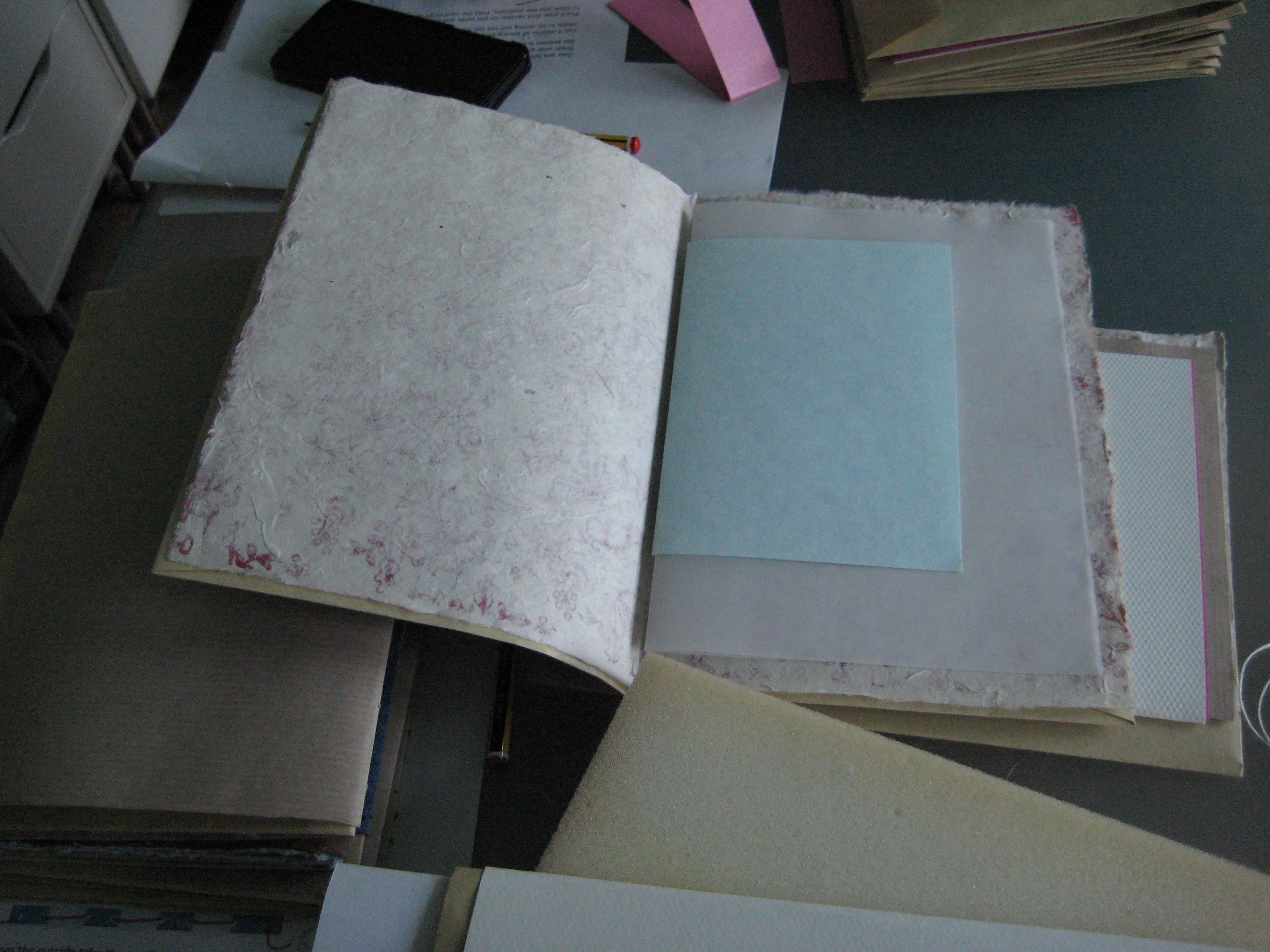
You can use any paper you like for signatures. I used a mix of wrapping papers, tracing paper; scrapbooking papers; artists sketchbook sheets; envelopes; sugar paper and brightly coloured printer papers.
Envelopes are really good. We used them on the outer most signatures especially as when you finally bind it all together you place A5 pieces of backing board inside the open envelope part and seal them closed. This gives a nice hard cover to your journal.

Stitching the signatures
Holes are made using a big needle, preferably the one you are going to stitch with. Linen thread (waxed) is a good strong thread to use, cotton threads will wear and break. Holes are spaced according to the widths of the bindings in the spine, and are as equal as you can make them.
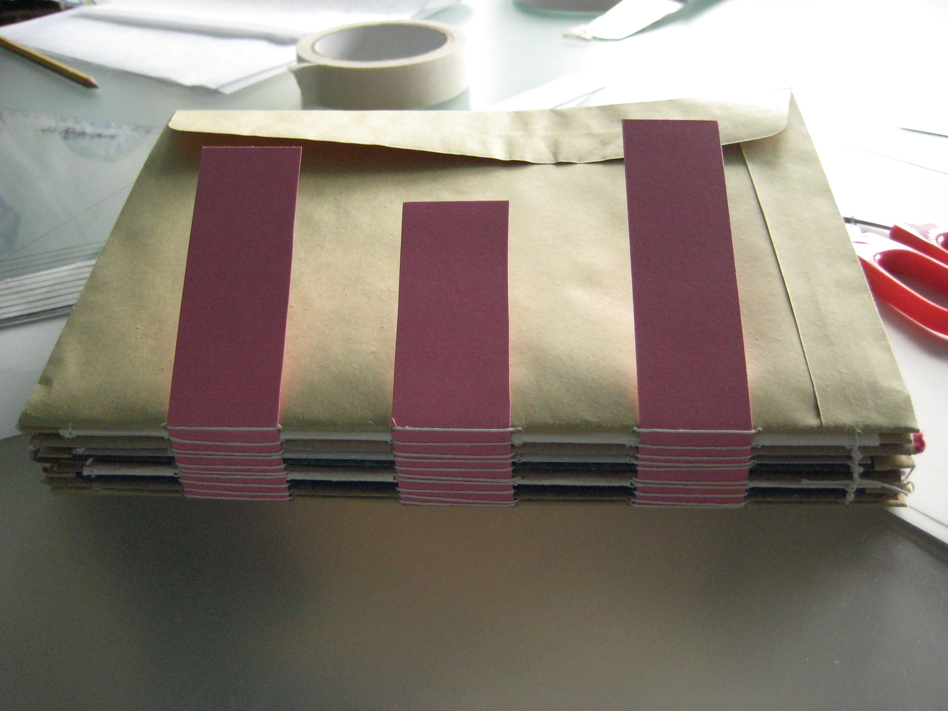
Stitched signatures threaded onto the bindings that form the spine
Once the signatures are all stitched and the bindings (pink card in the above image) are all threaded into place a little PVA glue is used to secure the bindings to the front and back covers. In the above image you will also see an open envelope flap; there is one like this front and back and that is where the backing board has gone to prove the hard cover for the journal.
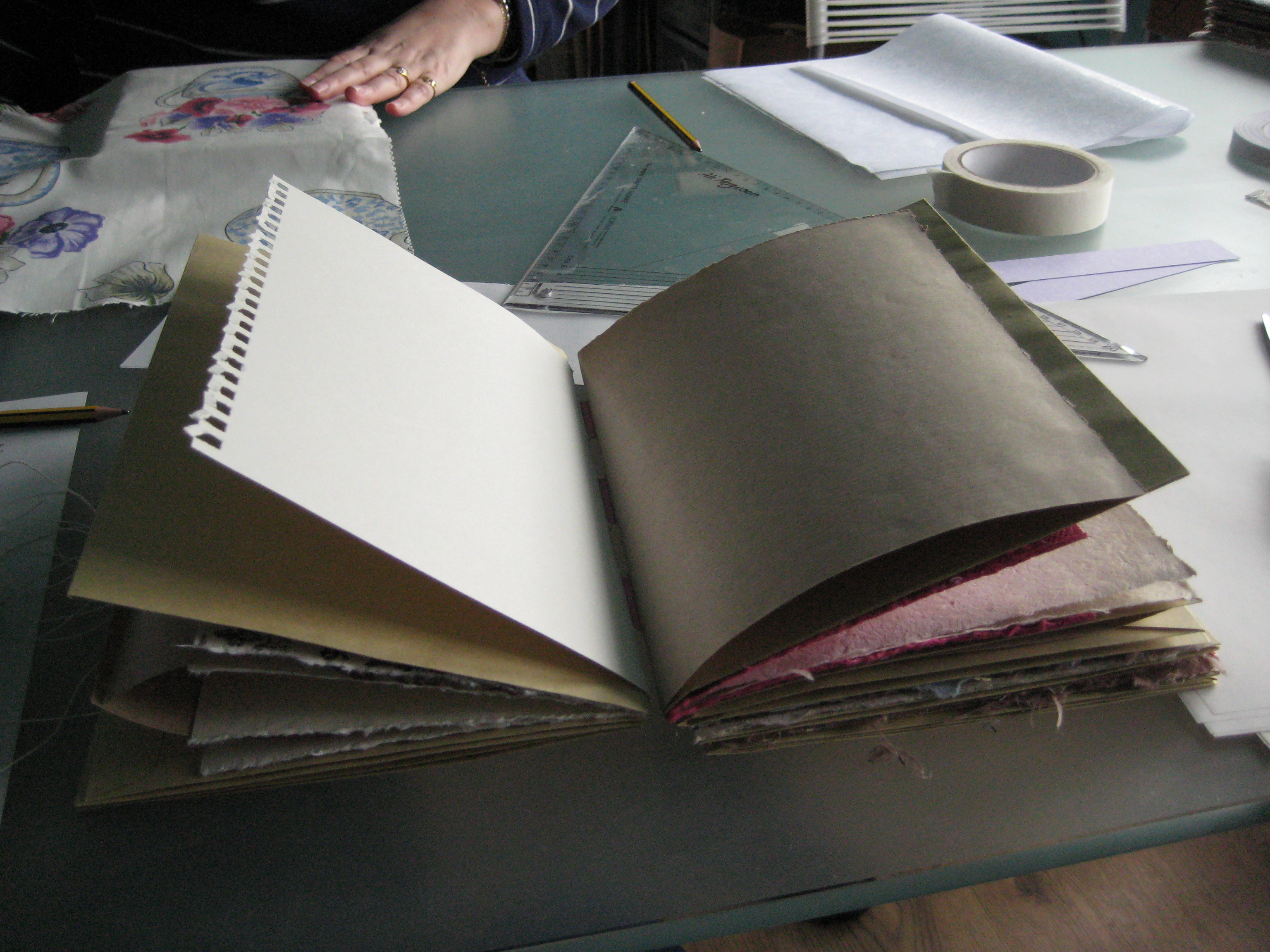
Basic journal ready for a cover – it even opens like a book!
So, now it’s time to take a break, leave the journal under a heavy object or other books to press it firmly and evenly and start work on preparing the cover.
Ali works with three styles of cover in this workshop; floral, vintage and bollywood. I’d decided to make this journal my college theme book, and the theme I’d chosen was ‘flowers and flora’. But I decided I didn’t want to plump for the floral design. Instead I’d been inspired by a sample of batik print fabric which had flowers on it, but was in lovely bright colours. So I opted for the bollywood style, as I’m also quite in love with recycled sari silks.
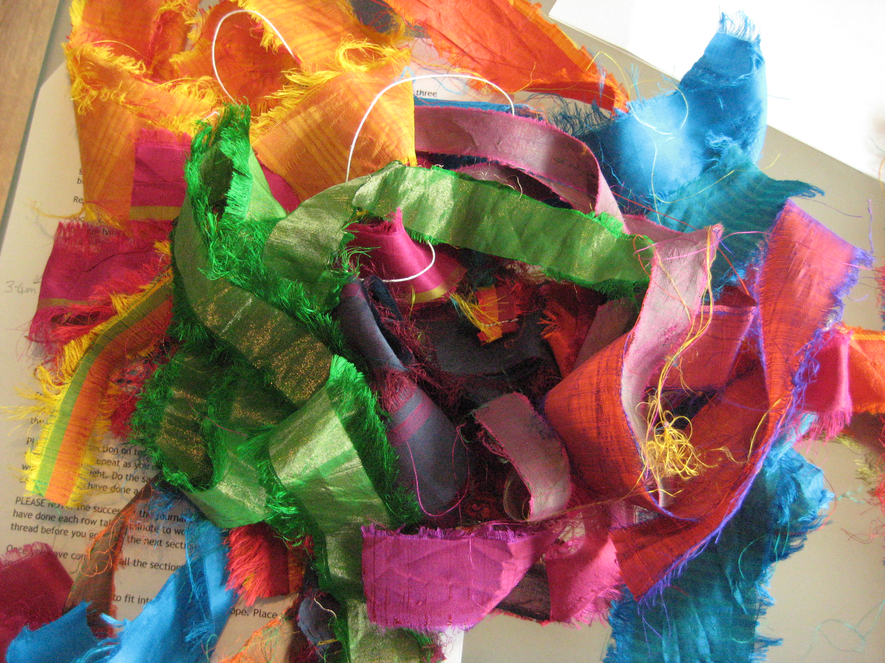
Pile of ironed sari silk strips
We used as a base for the fabric cover a piece of Vilene (iron-on interfacing) slightly larger than our journal cover. The base fabric is easy to iron onto this, and the vilene makes it sturdy enough to take further manipulations. Below is an image showing stitching used to further secure the samples to the vilene (we’ve all had experiences of interfacing coming away or not sticking at just the wrong moment!)

Ironed on silks to Vilene, stitched with a machine stitch in varigated embroidery thread
Once that was done I added a wrap-around ribbon for a tie to secure the book in a closed fashion. Also I added a ribbon as a book marker. Both were secured and decorated with shiny buttons as these look rather nice on the spine of journals.

All ribbons attached
It was the end of the workshop by that point and I hadn’t attached the cover to the journal. But that just required PVA glue, and besides I wanted to add some extra decoration onto the journal so I decided to do that all at home. But here’s a picture of the journal at the end of the workshop.

Cover on the book – all done up
I took my new themebook/journal home and atached the following extras to it.

I made some cord using machine stitch over sari-ribbon and then couched it onto the cover

Batik print fabric cut-out and bondawebbed onto the cover. Seed bead details the centre of the flowers
With those final bits added on to the loose cover I secured it to the journal with some PVA and that’s it done… all that’s left to do now is to fill it with my themebook thoughts.
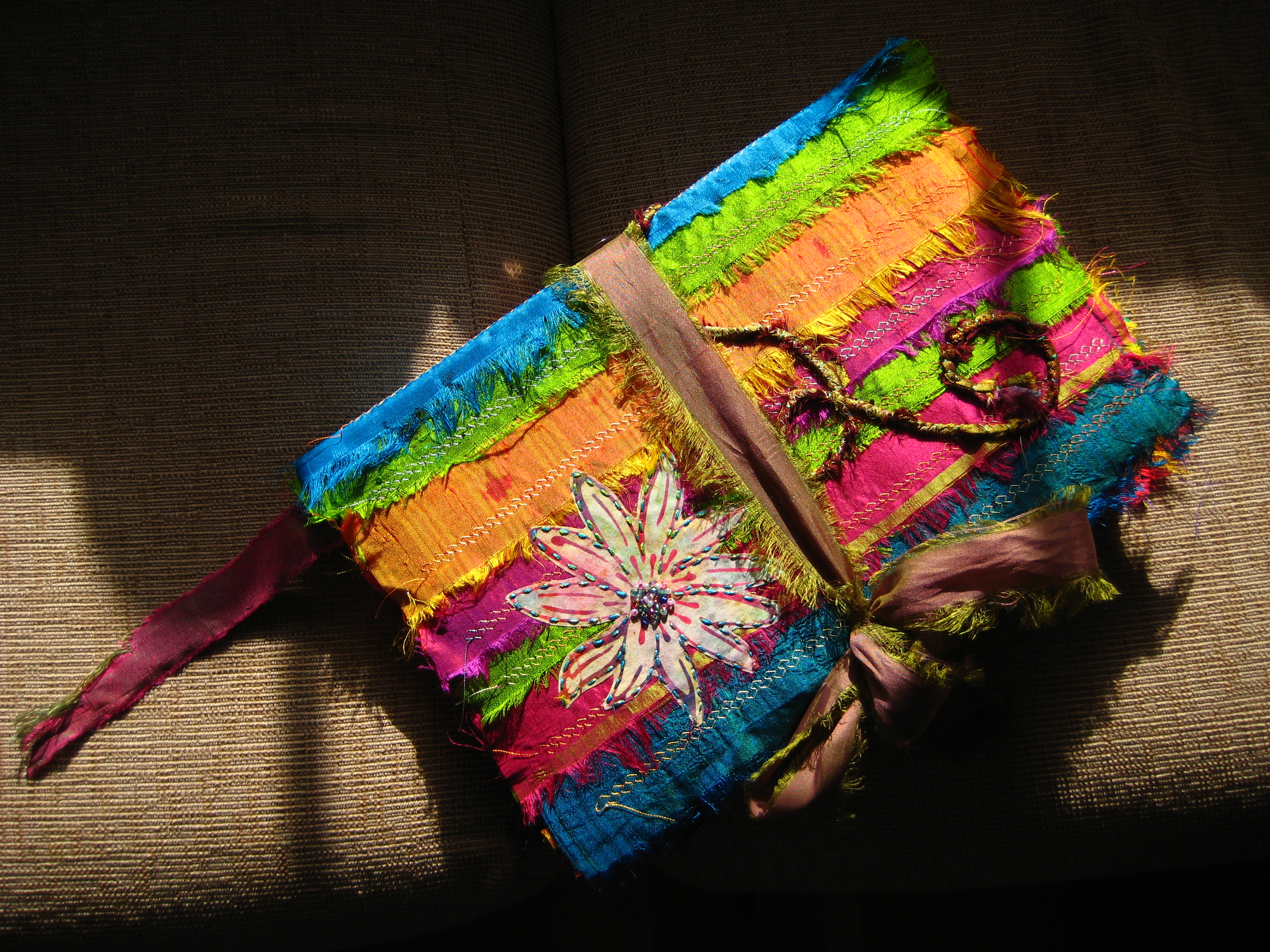
Finished journal waiting for use
One journey ends, another begins…